Pillar Page Guidelines
Guidelines for Pillar Page Creation
What do You Create a Pillar Page About?
Your goals two-fold: attracting and helping your prospect with more information and deep content about your product and how it solves their problem, as well as flat out SEO Google bait. You may only satisfy one of the two goals, but if you get lucky, you satisfy both.
Here are ideas to help you brainstorm:
- Something that your prospects would want deep knowledge about.
- You already have numerous content pieces (e.g. blogs/white papers) about said subject and it is naturally in your wheelhouse.
- You have checked Google and there is a topic that you feel your prospects would "Google" that you don't see a lot of competitive content in (Valhalla).
- Your company has a strategic initiative to attack XYZ market with XYZ product and you feel you have a very good story to tell and possibly some content at the ready.
- You just did a webinar, and the content was great. You could create a PDF and Pillar Page from it, and link to all the good in-house content you also have.
Building your Pillar Page
It’s time to design your pillar page and optimize the content on your website. First of all, you want this page to be ungated; users shouldn’t have to fill out a form to access it. You also want Google to be able to crawl it easily. If you’d like to give users the option to download the information in PDF form so they can save it to read later, consider giving them that option on this page as well. Include a simple form that allows them to download it quickly and easily in exchange for a bit of contact information (such as name and email).
Your page should be a clearly mapped out, scannable guide. Make sure you include each of the following elements as you build it:
- URL
- Should include the Title of the Pillar Page, a variation of H1 in the URL
- First couple of words should be the main topic (the words on the left)
- Example: "Content Strategy: Guide for UX Designers"
- Anchor-linked Table of Contents
- Near the top of the page
- Functions like the chapters of a book
- Links to main headers throughout your page
- Allows users to find specific sections they’re looking for and “jump” straight to them
- Core topic definition:
- "What is _________ " ... (the topic of the page) e.g. "What is the price of tea in China?"
- Use bullet points or numbered lists to win "how to's"
- More on snippet best practices below
- Use Headers and Subheads
- H1 (title) tag should contain core topic (the main topic keyword)
- H2 tags for main section headers
- H3 tags for sub-sections of main sections
- Include keywords if possible in a logical way, but don't force it
- Headline (H1) should be in the blog's special spot, or at the top of the pillar page. If at the top and there's no defined location, it should be in the font and size that matches that of the headline on the client's home page
-
- Use the font and size matching the subheads (H2 & H3) on the client's website
- Internal links
-
- Relevant sources that provide more in-depth information on topics
- Link to top-performing pieces on your website that fall within different sections of your pillar page (and link other pillar pages and blog posts BACK to the pillar page as well)
- Each section of a pillar page should link to another internal page covering that topic more in-depth, like an existing blog, or a high-ranking page within their site (and make these link BACK to the pillar page)
- Link with highlighted keywords/topic (not a "Click here")
-
- External links
- Sources that validate claims and add credibility
- Open external links in a new window
- Link with highlighted keywords/topic (not a "Click here")
- Images
- Support content
- Give readers visual aids
- Include alt text, referencing keyword and topic
- You have to downsize the images, can't just upload from stock library
- Include a blog author image 500x500px square
- More on image specifics at bottom of this page
-
- Back to top button(s)
- Placed in each main section or (at the very least) at the bottom of the page
- Makes it easy for users to jump back to the top of the page
- Saves users from having to scroll!
- Calls to action
- Use where helpful and natural
- Use a variety of CTAs: link, image, button
- Set up a popup targeted specifically to this page, set it to pop up on "Exit Intent". Make sure all other pop-ups are suppressed from this page.
- You still want this page to be conversion-focused, so don’t forget to include a form somewhere so users can contact you for help.
- Content formatting
- Introduction format:
-
Example of an introduction paragraphDownload this guide as an ebook and get a bonus Content Audit Spreadsheet! Simply fill out the form on the right, or scroll down and keep reading to learn about:
- How pillar pages increase SEO rank
- Selecting core topics and subtopics
- Using HubSpot's Content Strategy Tool
- Creating pillar pages and content
- Promoting your pillar page and content
- Measuring performance
-
- When using quotes, use indent feature and pull out to break-up page and add white space
- Introduction format:
Downloadable
Don't forget the downloadable. It should be gated and come with the full suite of:- Landing Page
- Thank You Page
- Thank You Email
- Promotional Blog Post
- Popup
- Adroll
Here are some of the Orange Marketing landing pages, you can click through for thank you and emails, etc.
https://info.freightpop.com/freight-shippers
https://go.isostech.com/migrating-to-atlassian-cloud-whitepaper
https://info.inymbus.com/returns-variance-whitepaper
https://info.tbconsulting.com/cybersecurity-among-the-top-3-risks-to-businesses-in-2020
Google Snippet Best Practices
Getting the Google Snippet is the icing on the cake and the ultimate goal. Due to where your client plays, it may not be possible. For example, everything Orange Marketing does/sells is where Hubspot competes. We have very little hope of getting the Google Snippet. Perhaps if we write a really, really good page on "SaaS Marketing Using HubSpot." #goals. Even then we probably couldn't pull it off.
To get the Google Snippet, you have to be playing in a space where it is actually possible. Here are some snippets that our clients got. It is a TON of free traffic. When we put out a pillar page, we monitor to see if we even came close, typically using SEMRush. You could have the Google Snippet in the morning, and then lose it in the evening. We have seen them come and go, like the wind! But when it hits, the traffic benefits are enormous. All for FREE!
From SEM Rush Blog Post on Snippet:
You should reference your core topic in each of these key areas on the page:
- Page title
- URL
- H1 tag
- Image alt text, use keywords
- Throughout body
1- Example of Snippet (from a keyword)
https://blog.tbconsulting.com/5-benefits-of-a-cloud-computing-security-solution
Google Snippet for cloud security benefits

2- Example of Snippet (from a keyword)
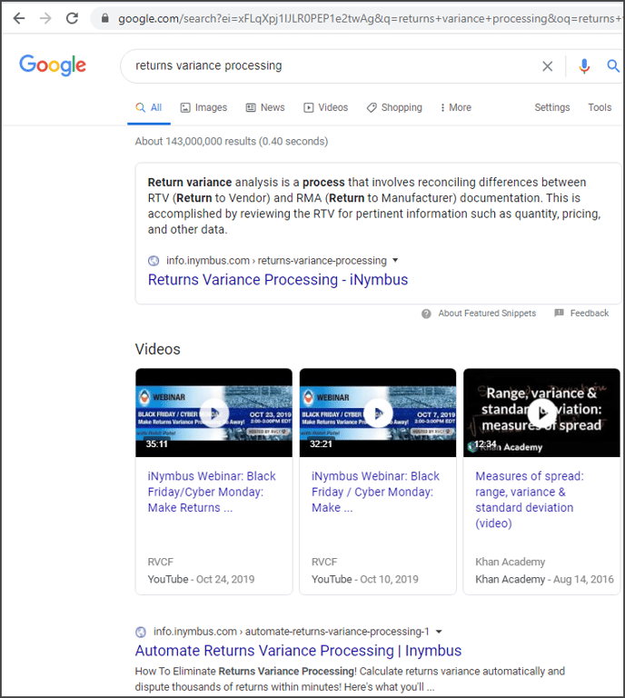
https://info.inymbus.com/returns-variance-processing
Google Snippet for returns variance processing

3- Example of Snippet (from a keyword)
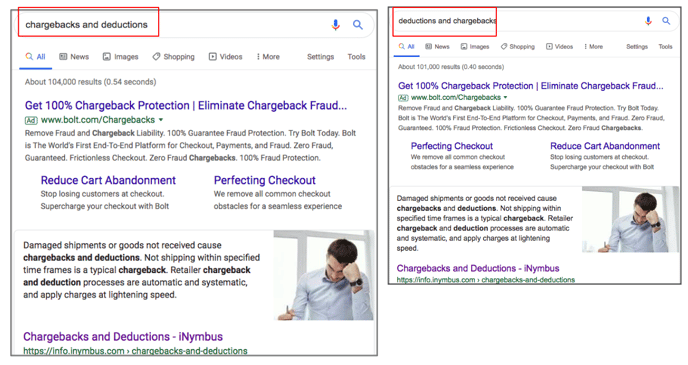
https://info.inymbus.com/chargebacks-and-deductions
Google Snippet for "deductions and chargebacks", "chargebacks and deductions"

Image Best Practices
Blog Featured image:
- Ideally 400x300 (1024x512 perfect image size for social media)
Blog Author Image
- 500x500 px square
Visual posts, with lots of pictures:
- Size: 663 x 398
- Wrap: Do NOT wrap. Keep margin-top and bottom of image 20px
List Post
- Size: 600 x 200
- Wrap: None
- Top and bottom margin 20 px
Interior images - smaller, with a variety
- Size: 250 x 190
- THEY MUST BE ALL THE SAME SIZE
- Alternate left and right blocks
- Wrap: square
- Padding 10 px
Linking Strategy
This is the final step in pillar pages. It is critical to do several things:
- Ensure you have navigation to your pillar page from your main menu (e.g. your pillar pages could be under "Resources" or under "eBooks" on the main nav.
- Go through your pillar page and link out to all relevant blog posts and web pages that relate to your pillar page topic.
- Go through your website and blog posts and link to your pillar page, wherever relevant.
- Promote your pillar page from your banner on your home page, and perhaps with popups.
A Note About Domains ...
- If you can, build your pillar page under the main domain for your site (as a Hubspot website page), meaning HubSpot is managing the main domain of the website and the client's website is on HubSpot.
- If the site is not on HubSpot, go ahead and build under HubSpot "Landing Pages." At this point, the world is 99% sure that subdomains don't really matter in search at all. But there is the 1%,
![OrangeMarketingemail sig.png]](https://help.orangemarketing.com/hs-fs/hubfs/OrangeMarketingemail%20sig.png?width=135&height=50&name=OrangeMarketingemail%20sig.png)